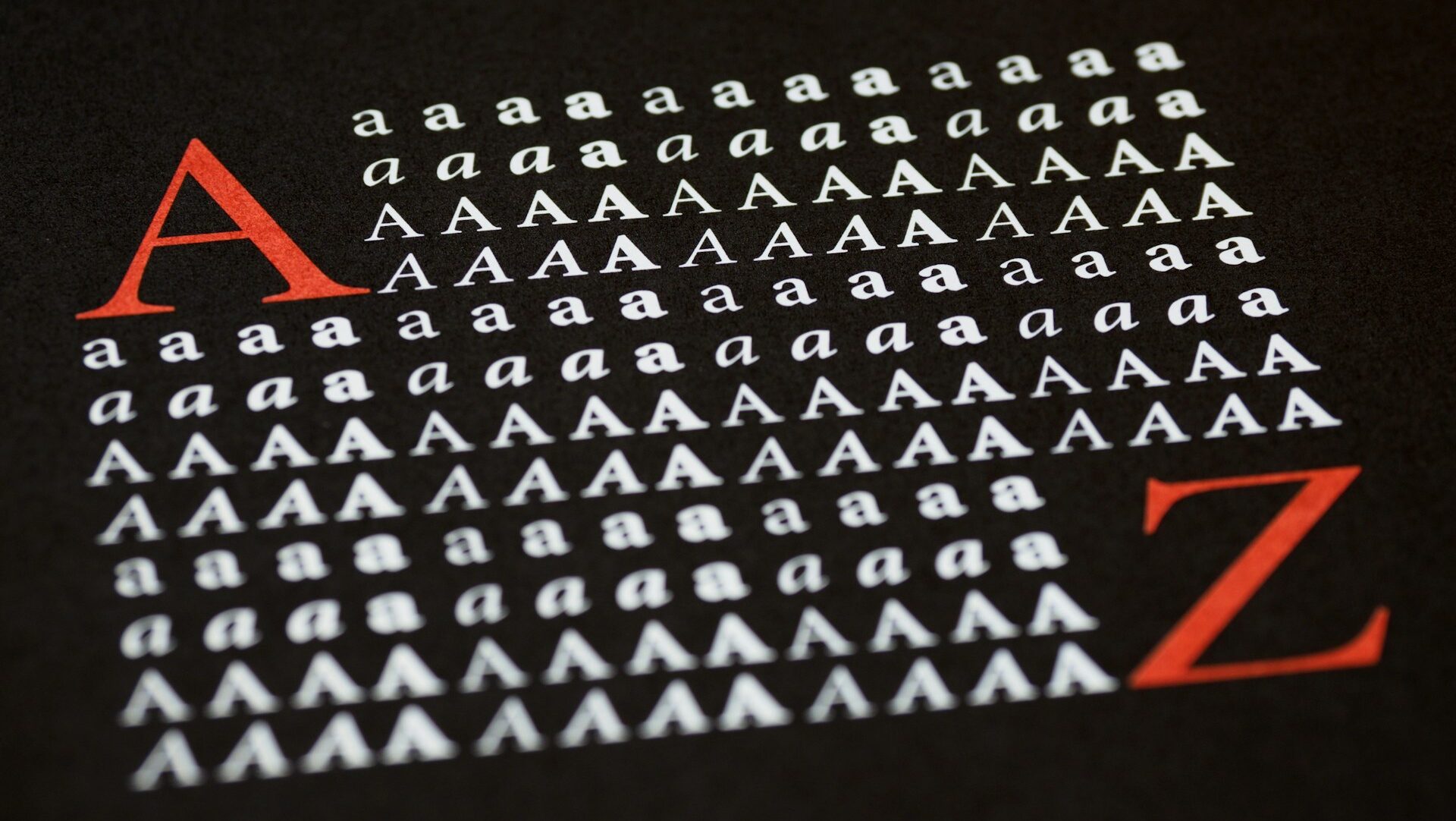
The State Department’s rejection of the Biden-era Calibri font for Times New Roman might not be the Trump administration’s most consequential decision, but that doesn’t mean it doesn’t matter.
On Tuesday, Secretary of State Marco Rubio circulated a memo declaring the serif font would again be the standard typeface for official State correspondence, as part of an effort to “restore decorum and professionalism to the department’s written work.” It evokes “tradition, formality and ceremony” better than the plain style his predecessor had implemented on the recommendation of the department’s DEI office, Rubio said.
The move prompted some predictable grumbling from the usual suspects — New York Magazine fretted that Trump “Is Coming After Our Fonts” and mocked the administration for “fetishizing trad aesthetics.”
But those “trad aesthetics” do matter, and as exhibit No. 1, I humbly submit Cracker Barrel’s ill-fated attempt to turn itself into the Calibri of Old Country Stores. In August, the company announced it would retire its nearly 50-year-old logo for a stripped-down version that removed the “Old-Timer” and anything else that could differentiate the brand from an urban slop bowl chain. At the same time, the company initiated a redesign of its iconic restaurants, replacing antiques that hung from the walls with whitewashed shiplap and abstract flour sifter art.
Cracker Barrel made the failed switch purportedly because the new logo would be “easier to read,” the same reasoning given by the Biden State Department for adopting Calibri. People hated it, a lesson that cost Cracker Barrel hundreds of millions of dollars to learn.
Like many things, the doomed Cracker Barrel rebrand — and the popularity of the sans serif font — can both be blamed in part on the internet. Across industries, brands have simplified their logos to be instantly recognizable on small phone screens and tiny thumbnails. Calibri’s defenders insist it’s easier to read on a screen, where most white collar work takes place.
In 2010, education bureaucrats removed cursive — cursive being to Times New Roman what Times New Roman is to Calibri — from Common Core educational standards. It was obsolete, they reasoned, in a digital age where typing and computer classes were more important.
Concurrently with the rise of bland logos, companies adopted bland art. The advertising world exploded with the blob-shaped, squiggly-armed, grotesquely-proportioned characters popularized by Facebook. The art style, dubbed Corporate Memphis, is — like Calibri — dimensionless and soulless. It’s the PowerPoint slide deck of graphics, color-coded and corporatized to the point of removing any visual interest.
From advertising boardrooms, the corporate slop has trickled down into the children’s book section. Realistic, visually interesting, and even beautiful illustrations have given way to oversaturated, cartoonish graphics. Faces are simplified and proportions exaggerated to the point that the subject looks less human. Not only is the subject matter less aspirational, the accompanying art is too. Now AI-generated content is reportedly being passed off as kids’ lit, a fact that indicts the current industry at least as much as it does the ChatGPT profiteers.
The dumbing-down of visual aesthetics — from font to logos to illustrations — is not without consequence. It would be foolish to assume the aesthetics we surround ourselves with have no effect on how we perceive the world. Official correspondence should be professional, not infantilizing. Sans serif is the medium of corporate jargon and DEI trainings. Fonts like Calibri are literally stripped of their character, reduced to their simplest and most utilitarian form. So are graphics and illustrations that erase shading, detail, and even faces in favor of blob art.
The same also goes for architecture, where structures that were once considered a prime medium for artistic beauty are reduced to artless or even intentionally ugly façades. Earlier this year, disgust for such an evolution inspired the Trump administration to reject the brutalist design of modern federal buildings in favor of classical structures.
Public buildings should “uplift and beautify public spaces, inspire the human spirit, ennoble the United States, and command respect from the general public,” Trump wrote in his executive order on the subject.
We should expect no less from any other visual medium. After architecture and fonts, the administration should tackle agency uniforms. Can we put Ralph Lauren in charge of the Postal Service?
Elle Purnell is the assignment editor at The Federalist. She has appeared on Fox Business and Newsmax, and her work has been featured by RealClearPolitics, the Tampa Bay Times, and the Independent Women’s Forum. She received her B.A. in government with a minor in journalism. Follow her on Twitter @_ellepurnell.