This piece was originally published on the Polimath Substack.
There is something really fun about data detective work.
Sometimes this work is done quickly. Someone will show a chart, point to the source data, and I’ll grab the data, and it turns out that the chart is just a simple graphical representation of the source data. For people who care about the truth, this is the ideal scenario, but it is also boring. I want some really outrageous narrative driven by a chart, but it’s hard to figure out where the data came from. That’s where the real fun is.
I got that this weekend in this chart, which came to my attention through Jeremiah Johnson. The chart tells the story of a vindictive, cartoonishly evil president who is making the victims of disasters suffer because they live in the wrong state.
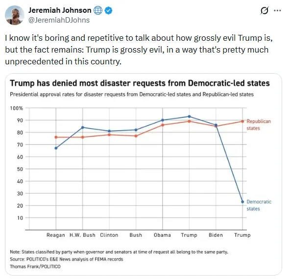
This chart comes from a Politico article with the title “It’s 3 times harder for blue states to get disaster funding under Trump.” The key data point in this article is in the chart above.
The president has approved just 23 percent of blue state requests for disaster aid, compared to 89 percent for red states.
Charts like this very rarely come from nowhere. Most journalists at least still have enough integrity to not completely make up data. The nature of this particular accusation is extraordinary and extreme. Denying emergency relief to American citizens based on their politics would be an act of wanton cruelty. But that severity cuts both ways. To falsely accuse the Trump administration of such an act would be a cynical and cruel thing to do. If someone were to cherry-pick data or manipulate their data sets in order to cause their fellow citizens to believe a falsehood this severe would be the act of a sociopath.
I went to find out if this is really what the data said and how the data was manipulated in order to get to the chart above.
Finding the core data was pretty easy. FEMA hosts a comprehensive set of data on the OpenFEMA website. The two data sets that we care about are Declaration Denials and FEMA Web Disaster Declarations.
Let’s compare Trump’s second term to Joe Biden’s term in office. I’m doing this because that is a comparison already being made in the chart above, but also because that trims our data set down so we can talk about it in a little more detail.
We’ll start with some raw stats from this data. During Joe Biden’s term, FEMA denied 56 aid requests and approved 512, a 9.9 percent rejection rate. So far during Trump’s second term, FEMA has denied 24 aid requests and approved 141, a 14.5 percent rejection rate.
If we’re trying to tell a “Red vs. Blue” partisan story, it’s going to matter a lot how we define Red and Blue. It’s pretty typical to use the presidential election results as a proxy for redness and blueness. But, then again, the chart says “Democrat-led” so maybe we should use the party of the state governor as our indicator.
Politico rejected both those definitions and decided that “[party]-led” means that a state has a governor and two senators from the same party.
This definition should raise eyebrows because it immediately kicks 10 states out of our data set (11 if we count Virginia when they had a Republican governor last year). North Carolina and Kentucky both have Democratic governors and Republican Senators and were both subject to recent natural disasters but they will not show up on this chart at all. It also means that, if the narrative of this chart is true, Trump is punishing two states that voted for him (Arizona and Michigan) because they are “Democrat-led”. That seems like an odd thing to do.
I want to show how this framing changes our results. Let’s look at Biden-era FEMA denial rate by party, but change our definition for “red” and “blue” to reflect the election results (which states voted for Biden in 2020), the party of the governor, and using the Politico “governor plus both senators” metric.
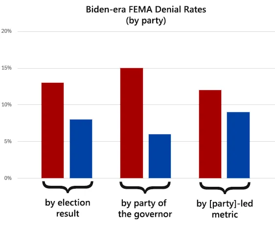
If we wanted to tell a story of a vindictive Biden administration that was punishing red states, we would use the “party of the governor” metric. This makes it look like the FEMA denials are almost three times higher for “red” states than for “blue” states.
If we do this for Trump’s second term, we get less variation but higher denial rates overall. FEMA is denying red state requests under Trump at about the same rate as they denied red state requests under Biden. But blue-state denials have surged.
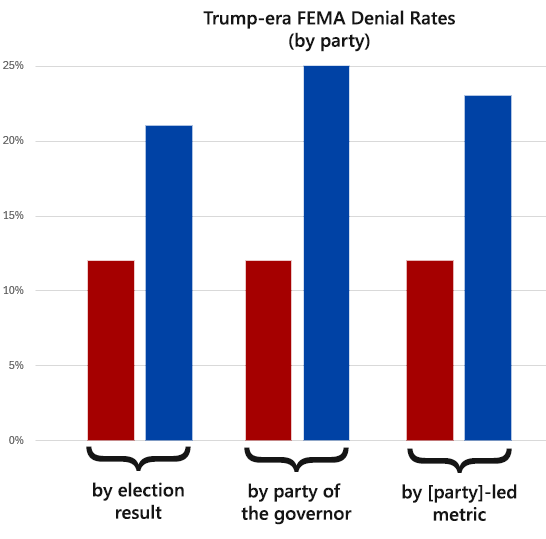
But something is still wrong here. The worst version of the Trump data that we see above is showing a denial rate of 25 percent. How on earth is Politico getting a 77 percent denial rate?
The answer lies in something that is simply not in the Politico article. In the article (and in the chart) they say that Trump denied “disaster requests.” This is, quite simply, untrue. What they don’t tell you is that they are charting only disaster requests that are categorized as “Major Disaster”.
A “Major Disaster” FEMA designation turns on a huge pile of additional public assistance, including “permanent work” for improvements to roads, utilities, and buildings. It’s an important designation and requires FEMA to do additional work in validating this designation.
This should be uncontroversial: If you are writing a story about a data set, you need to be precise in your definitions and what you claim you are showing to your readers. In this case, Politico writer Thomas Frank failed at his job. He wrote an entire article about an untrue metric (that Trump denied “most disaster requests”) because he neglected to give the appropriate labels and context to the data he was presenting.
It turns out that when you combine this “Major Disaster” designation with the “[party]-led” filter, it removes many red state denials from the data set. With the data that are remaining, we are looking at 13 total FEMA denials against 32 FEMA approvals.
Given that the topic at hand is natural disasters and we’re covering a period of time that is less than 18 months, it would be ridiculous to draw any systematic conclusions with such a tiny data set.
The Politico article says they did “a review of 2,500 natural disaster declarations.” Technically, I suppose that this is true. They did review 2,500 disaster declarations so that they could reduce their data set to 45 data points that told the story they wanted to tell. Only after they eliminated the data that rejected their narrative and massaged the remaining data to their advantage were they able to make their outrageous claim.
Readers Must Wise Up
I’m going to confess that I did not for a moment expect to discover that Politico was telling the truth. I assume that they will torture the data until it confesses. I’ve been through this cycle of data discovery, reconstitution, and understanding so many times that I don’t feel the need to pick apart every bad chart or duplicitous story.
I know that most data journalists will lie, I know that they will filter and sort and glean and sift until they get the angle on the data that tells the story they wanted to tell from the beginning. I don’t even blame them for it anymore. It would be like getting angry at a wasp for stinging you. They will just do it. You can’t shame them or reason them into doing better work. If you showed Politico that you know exactly how they used data to lie to you, their response will be some version of “So?”
But I am developing more disdain for the people who read this nonsense and have no sense of skepticism. This disdain is not a partisan one. We are being lied to constantly by people who have no regard for the truth and who feel no guilt in their endless manipulations. Sometimes we get lucky and we can figure out exactly how we have been lied to. But we can’t do that for every lie, every chart, every narrative. It is cheap to lie and expensive to discover where the lie came from.
We need our defenses to be up by default. We need skepticism and a sense of inquiry. We need the source data and a clear explanation of how the author got from that data to his or her conclusions. The era of trust in journalists (even data journalists) is long over. Everything is a lie until they show you how to verify the truth for yourself.
The rest is up to you. Find people you trust and lean into them. Discover things on your own. One of my data heroes is Kelley K and her super power is that she reads the source material. I don’t want to dismiss her tremendous work and intellect, but that really is why she is able to discover the truth and hold people accountable for their lies. She just reads the source and that’s all she needs to do to discover the truth.
It’s important to ground ourselves in data. One of my fears for the future is that bad actors will realize that the source data still holds immense power and they will try to sabotage these data sets at the source. I don’t know how to protect against this kind of violence, but it is worth our time to think about how we can best preserve our access to quality data about our government. It is the sort of thing that will pay bipartisan dividends and improve trust in our institutions. God knows we could use some more of that.